

Apple's Liquid Glass Era: What the New OS Design Means for the Future of Digital Interfaces
Apple has done it again.
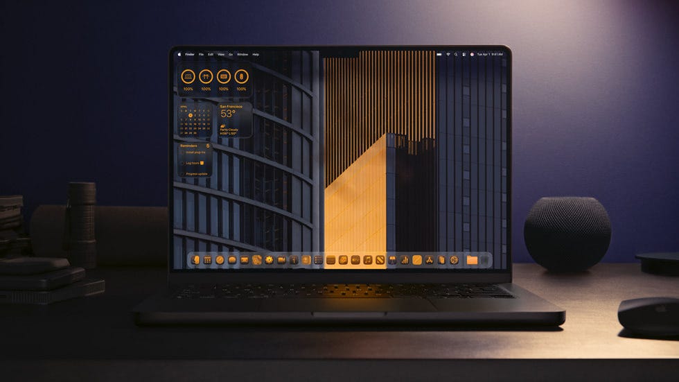
At WWDC 2025, Apple introduced what may be its most visually ambitious redesign in over a decade: a system-wide aesthetic called Liquid Glass. From iOS and iPadOS to macOS and visionOS, every corner of Apple's ecosystem is getting a glossy, fluid upgrade that merges realism and depth with elegance and performance.
This isn't just a visual refresh, it's a design statement, a bold pivot that blends subtle glassy materials with AI-powered functionality, personalized interactions, and a new sense of delight in digital interfaces.
In this article, we're diving into what Liquid Glass really is, why it matters for designers, and what ripple effects we might see across the design industry.
Wait - What Is "Liquid Glass," Really?
"Liquid Glass" is Apple's new visual design language. At first glance, it feels like a mix of skeuomorphism's tactile nostalgia and neumorphism's soft, shadowy elegance yet far more refined.
It's defined by:
-
Dynamic translucency and refined glass-like layering
-
More realistic shadows, highlights, and motion
-
Increased emphasis on depth, lighting, and personalization
-
A unified aesthetic across all platforms from phone to Mac to headset
Gone are the overly flat, minimal surfaces of early 2010s design trends. Instead, Apple's UI now glows, flows, and responds with more visual depth without losing clarity or accessibility.
In Apple's own words, it's "delightful and elegant" but also, more immersive and intelligent.
More Than Just a Pretty Interface
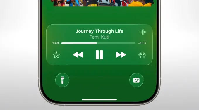
Liquid Glass isn't only about visual charm. Apple has tightly integrated this aesthetic with its advancements in AI, widgets, and personalization.
For instance:
-
Home screens adapt based on time, habits, and location
-
Widgets are now smarter and more interactive
-
Navigation gets contextual, almost predictive
-
VisionOS fully embraces Liquid Glass as a native metaphor for spatial computing
It's a design system that feels alive less like a static interface, more like a digital companion.
And here's the kicker: it's consistent. Whether you're tapping on an iPhone, sketching on an iPad, editing on a Mac, or immersed in Vision Pro you're in the same shimmering, intuitive world.
A Nostalgic Future: Why This Feels Familiar (And New)
For seasoned designers, Liquid Glass will spark flashbacks to the glossy iOS 6 days but this isn't a retro regression. This is nostalgia reimagined.
Where skeuomorphism once leaned too heavy on realism, Liquid Glass brings:
-
Depth without distraction
-
Texture without clutter
-
Emotion without compromise
It's an elegant middle ground between skeuomorphic playfulness and flat design clarity.
This speaks to a larger shift happening in design: a rejection of over-flattened, sterile UIs in favor of interfaces that feel alive, responsive, and humane.
What Designers Can Learn From Apple's Liquid Glass Design
Whether you work in product design, web, or motion there are key takeaways:
1. Depth Is Back (Subtly)
Flat design had its moment, but users crave tactile cues. Liquid Glass uses blur, shadows, and lighting to create hierarchy and meaning without overwhelming the screen.
2. Personality in Design Isn't a Sin
Apple has embraced delight again. Tiny animations, ambient transitions, personalized widgets they all help users emotionally connect to the system. This is a great reminder: function and feeling can coexist.
3. Design Systems Should Adapt to Context
Apple's OS now adapts based on what users need and when they need it. Responsive design isn't just about screen size anymore it's about time, intent, and behavior.
4. Material Design Matters Again
Even in digital environments, the metaphor of "materials" is powerful. Liquid Glass behaves like a material bending light, layering transparently, flowing naturally.
What It Means for the Design Industry
With Apple going full throttle on this new aesthetic, expect ripple effects across:
-
UI kits and template markets: Tools like Figma and Framer will likely see a boom in glassy UI kits and Liquid-inspired design packs.
-
Web design: Expect more glass morphism styles, soft shadows, blurred backdrops, and adaptive layouts.
-
AR/VR interfaces: VisionOS is positioning Liquid Glass as a foundational spatial UI this could become a design language standard in 3D environments.
-
Brand design: Brands will be inspired to feel more "alive" and fluid, moving from cold minimalism to playful elegance.
Will Liquid Glass Stick Around?
Trends come and go, but Liquid Glass feels more than a trend. It's a system-level philosophy that combines performance, accessibility, and aesthetics.
Why might it last?
-
It's part of a long-term spatial computing vision
-
It balances familiarity with freshness
-
It aligns with generative and AI-powered UI trends
As more apps and developers build around this aesthetic, Liquid Glass could become the new normal for Apple ecosystems and a benchmark for interface design globally.
Wrapping It Up: The Future Looks Shiny
Apple's Liquid Glass design is more than just pretty pixels. It's a subtle revolution in how we relate to our digital environments: more natural, more adaptive, and far more beautiful.
For designers, it's a reminder to embrace emotion in design, rethink visual depth, and create interfaces that feel more human.
So, whether you're updating your design system, sketching new UI concepts, or building the next big app don't be surprised if a bit of Liquid Glass starts flowing into your work too.
More from Enamo Studios
Enamo Studios is a design-driven creative studio focused on art direction, graphic design, and digital product development.